Material has been reproduced here to facilitate private study, research, critisism and review, as permitted under the Copyright Act 1968. The Material has been made available for general personal use only and is provided without any express or implied warranty as to its accuracy or currency.
Links to articles on external sites that refer to the work of David Hume -
Again, please note that these are external links, and no representation is
made regarding their accuracy or currency.
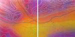
Hume's topographic panoramas, painted on bright galvanised steel with ultra vivid colours and pointillist clarity, lend the Australian landscape an aura of the hyperreal. Although this country is his starting point and inspiration, these works also succeed in transcending the particularities of place. They may be read as meditations on the Great Southern Land, or they can function in a broader context, as colouristic exercises of great aesthetic appeal.
Hume became more fascinated by his own environment after a trip to the Northern Hemisphere. His native terrain has always been a source of interest but he did not begin working in his current mode until after he had seen other landscapes first hand. While in Venice he taught himself how to appreciate the surface qualities of 'great' paintings. He began to approach famous works by old masters to within an inch of their surface, and by doing so he noticed that there came a point where the image disappeared and the mark of the artist was all that remained. He was compelled to thoroughly reconsider his own practice and began to experiment with more complex visual effects. Such techniques are everywhere in evidence in his paintings, in which well defined images may shimmer and disappear into a sea of dots upon closer inspection.
Hume's view from the plane-window as he flew home from this overseas experience is something he continues to mine years later. This visual information, still seen in his mind's eye, has informed much of his recent work, particularly the Overland series, which also marked a brief return to canvas. For this show he chose to investigate the symbols for airfields, rivers, lakes, boundaries and fences, signs that can all be found in topographical maps.
In fact, much of Hume's practice has been inspired by maps, which he regards as 'tremendously dense ways of recording and transmitting information'. Even though Hume does not intend his paintings to be topographically correct, he believes they should 'communicate the sense of wonder' he feels 'when looking at a map and trying to picture the land and all the stories that go with it'. In this way, he harbours a respect for the various layers of history existing simultaneously in any given location.
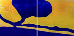
While celebratory, his painting also critiques our short-sighted attitude towards our natural resources. By turns, his gaze lands upon the vexed issues of nuclear testing, mining and unnecessary damming. In The Road To Andamooka, named after a documentary made by his grandfather, no-go zones are consciously mapped onto partitioned territory as floating signs for the viewer to decode. Here, a formerly beautiful red landscape becomes prosaic under the weight of human prohibitions. Similarly, his works Malkara and Jindivik reinforce his concern for the repercussions of nuclear testing with their ominous conflations of bombs and planes. In his Lake Argyle works he refers to the artificial lake created when the Ord River in Western Australia was dammed in 1972, and the effect this had on the surrounding area. Through his charting of these hazardous areas so close to home, Hume implicitly critiques white men's interventions in the landscape.
Given the technical excellence of Hume's paintings, it comes as no surprise to discover that he has an accomplished background in mathematics and science. Hume's sensibility is evident in the way he tames the materials he employs. Galvanised steel, the base element of his current paintings, reflects almost all the light that falls on it, giving us a sense of the unique thermo-luminescence of the Australian scene. In addition, the zinc crystal patterns on the surface of the galvanised steel imply notions of construction and exploration, aspects of land usage which preoccupy him. Likewise, his inventively idiosyncratic spray technique appears to serve his intentions effortlessly.
Nonetheless, the near-perfect forms Hume produces mask an intriguing passion hovering beneath the surface. Somehow these works have the capacity to move despite, or perhaps because of, their steely accuracy. Although he does not use the same materials or employ the ceremonial methods of his indigenous counterparts, Hume's work has on occasion been mistaken for Aboriginal art. This ambiguity adds an interesting twist to the reception of his painting. One might argue that Hume's practice has arrived at a similar place independently through his concern for the local landscape and his sensitivity to its many nuances which are usually seen as the exclusive province of Aboriginal people. His painting might be read as part of the process poet Les Murray has called 'the slow moulding of all people within a continent or region towards the human form which that continent or region demands'.
TO SAVE YOU the trouble of going, let me describe a Year of the Outback exhibition. Landscape of course. Blue sky. Red sand or dirt. Trees. Perhaps a creek bed. A gorge or rugged mountain rampart for dramatic effect. Clouds if a sunset is called for. On rare occasions be prepared for a stockyard, perhaps some stockmen, some cattle and gorses. Plenty of dust. For fresh insights and observations about the life of people living in towns and small settlements, people who drive cars rather than horses, work in mines, fish, eat, dance, live, die, look elsewhere. The unwritten rule that Outback equals blokey, drovin., scenic landscape types of things means that the complex nature of outback environments and human response is rarely explored. There are exceptions.
David Hume had his epiphany overseas, in Venice, while looking closely at the work of traditional artists. In realising there is a moment when image dissolves into a web of markings and dots, he realised that here was a way of adding complexity to his images. On the flight home to Australia, he did as many artists before and since continue to do, gazed down at the seemingly endless inland below, drawn to its seamless but ever-changing identity. Coming from a science and mathematics background, he was attracted to mapping as a means of encoding the different fields of information, which are associated with any given terrain.
His bold experiments in layering his sprayed and stencilled images on sheets of galvanised steel, have paid dividends in terms of addressing the shimmer factor which accompanies any attempt to fix a landscape as something solid and in focus.
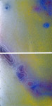
As the viewer changes position so each "mapscape" changes from something solid and rich in colour to a figment of the visual imagination. The shadow of Fred Williams fell across some images, which were too eager to close on the subject and represent it as something real.. But in two monochromatic works in particular where the artist relied almost entirely on shifts in pattern and texture to define some sense of location, Hume looked to be setting out on a genuine journey of exploration.
Spatter and spray infills will always threaten to become reflexive and predictable and Hume must be aware of how quickly an "instant" effect, particularly the reflection of the metallic surface pushing through the pigment, can become routine and lose its capacity to intrigue and enchant. But right now he has taken to his subject with high spirits and a shrewd aesthetic eye, which invested the strongest of these images with a genuine sense of discovery and personal conviction.
Of the artist's environmental concerns referred to in the catalogue essay there appeared to be little trace but the materiality of these paintings with dots of pigment suspended as it were on a shining pool of light, spoke of transience and vulnerability. At one level this body of work belongs to the more innovative spectrum of inland/outback landscape genre, which distinguishes more interesting artists from the plodders.
Hume has hit on something which may prove a gimmick or a genuine breakthrough in terms of trying to express the seen and the known dimensions of inland environments. He accelerated growth once before by studying the technique of earlier artists. Perhaps it is time to renew the experience, with half an eye on China and what its traditions can teach about spiritual journeys translated into landscape form.
Topographical Imagery
Rip it Up Magazine April 2002
This show is something truly original, and I really liked it. Hume's paintings are slick and shiny and look like they were made by a contemporary, aboriginal Jackson Pollock with shiny candy paints.
Although Hume isn't aboriginal, his paintings are often mistakenly assumed to be. This has nothing to do with his use of colour or technique - but probably to do with his subject matter which focuses in this series on topographical imagery.
These metallic, luscious paints have been layered on sheets of galvanised steel, which is left to shimmer through to create the topographical line work.
I thought it was fascinating to note that Hume's background is not in the arts but in Mathematical Physics and Pure Mathematics and that he gave up being a maths teacher in 1989 to paint.
My favourite work was probably 'North of Mt Parker 1' which is four steel panels painted mostly in vivid red patterns. I also really liked 'Osmond Creek 2' which is painted in purple, orange and red.
There are also a few works on canvas and I particularly like 'Riverbend 3' which is an S pattern built up with layers of pearly mint-green paint which looks just delicious. I do admit though that the works on steel are much more appealing and it is strange that they have not sold as well as the canvases. Anyway - a great show.
Overland
Notes on the exhibition by David Hume 2001
Aerial views have been central to my work since I took a long flight over the centre of Australia in 1995. I was returning from a month spent painting in Europe, and followed, more or less, the reverse flight path of the test rockets launched in the fifties from Woomera, to which I referred in my 1997 exhibition “Andamooka”. The 1998 exhibition “Coorong to Kimberley” traced a similar path. For the current exhibition I have chosen as an icon the symbol of the airfield. Returning to the land and flying over it gave me the key to the work that I have done in the last seven years. The symbol of the airfield provides a point of reference. It shows our own point of departure gouged into the land over which we travel. It dispels the myth of the impartial observer who can travel through a place, observe, and report without changing it. As we travel over or above the land we become part of it. The land has allowed us here and we should acknowledge the fact.
The aerial view has an important place in Australian landscape painting. Before manned flight there was an idea that one should climb a mountain to see the view; to search far horizons over new and undiscovered lands. This seems particularly important in the colonisation of Australia, where there has been an imperative to “go forth and open up the country”. Landscape painting from these early times, with its often cumbersome representations of the flora, concentrates on the wide view, and shows the land with one eye fixed keenly on its potential for development. By the time the Heidelberg school had managed to capture the light and vegetation they were already painting a myth of the bush to be appreciated by their predominantly urban audience. This, of course, has continued to this day.
Flight has lifted the point of observation higher. Nolan’s paintings of the Macdonnell ranges (1949) made a particular impression on me. It was my first exposure to an aerial perspective of the landscape, and it took the idea of looking to the horizon over rugged mountains one step further than I had seen before. Appropriate also is idea of the land seen through the window of a light aircraft. The light aircraft had replaced the horse and camel as the new vehicle of discovery. The pioneering identity exemplified by John McDouall Stuart had been replaced by Lang Hancock. Interestingly, the techniques used by Nolan in this work were decidedly less modern than a lot of what he had done before. It seemed a return to a safer, more classical way of painting the land, as if the power of the place was so vast that it set the painter back a few paces. Olsen has since used a freer perspective, allowing the viewer to meander over the surface of the work. Not that there is anything peculiarly Australian about encouraging a viewer to float above and along a painting. Hockney discusses it at length in relation to his works such as Mulholland Drive: The Road to the Studio (1980), and is quite open about his appropriation of the idea from Chinese scrolls. The stunningly beautiful work of Rover Thomas also has the capacity to transport the viewer, his wonderfully simple graphic elements and strong colours capturing the spirit of a place.
As well as the power of great works I am interested in aesthetics, in the Kantian sense of the word, and this brings me again to maps and symbols. I have said in the past that I find the map a tremendously dense way of transmitting information, and that I love poring over them and thinking of all the stories they contain. In this exhibition I explore the idea of whether topographic symbols, created for the purposes of communication and navigation, can be considered to have aesthetic beauty in their own right. Kant took as his starting point a universal response to the beauty found in natural objects. Can a mark for a river, “Riverbend #1” be at the same time a symbolic representation of a river, a map, and an aesthetic object? Take, for example, what has been written about the drawings in the Lascaux caves. Their purpose is though be essentially practical; for instruction in hunting, as an offering to the gods in hope of bounty. Yet they are generally described in aesthetic terms, as “beautiful” drawings with qualities of “strength’ “power”, or “grace” It is interesting to me that some viewers have found beauty in my work, whose essential elements include contour lines, symbols from maps, and raw colour applied to galvanised steel.
My first aerial abstract landscapes were born of a desire to express some of my feelings for the land by attempting to capture its textures and colours. I sought to include some of the fascination that I felt towards maps, and the stories and symbols they contain. I also began to use topographic symbols in my own work. Contour lines played an increasing part, along with symbols for rivers, lakes, boundaries and fences. In this exhibition I have chosen, for the first time, to use canvas as a support for the paint. My earlier work was painted on flat sheets of galvanised steel, both for its aesthetic qualities and as a reference to the strong connections of that material to the outback regions the work depicted. Now I choose to exhibit paintings on canvas, to highlight the idea that canvas should not be an invisible support; that one should ascribe the same cultural weight to its use as people have to my use of steel. A viewer is unlikely to remark that it is unusual to use canvas, as they often do when seeing one of my paintings on metal for the first time. Canvas has become a background noise no longer heard. I want to reawaken an awareness of it.
To do this I have taken three of the compositions used in this exhibition and painted them out in white, so that all that remains is the surface, still holding a recognisable image in the texture of the paint. I have then sprayed these in metallic enamel paint. Canvas painted to look like gold is patently not so; the weave showing through from beneath the glitter of the surface highlights this, at the same time nodding to Lichtenstein and Magritte (Ceci n’est pas une pipe). The other colours I have used are “Hammered Metal Finish” in green and blue. Green and blue are colours of nature, but these particular examples are commonly found on heavy cast iron machinery of the type made in England in the early twentieth century, and now copied in China. I find it satisfying to redirect them into representations of the Australian landscape on canvas.
Red Sky Mining
Catalogue essay for "Beneath the Beyond 2" by B.L. Magner
Australia is carefully measured and mapped onto itself through the re-visualising process of David Hume's abstract landscapes. The calculated scenes evoked by Hume's topographic panoramas, with their ultra vivid colours and pointillist clarity, lend the Australian landscape an aura of the hyperreal.
For over five years now, Hume has been composing large acrylic paintings on galvanised steel, a material which lends itself well to the depiction of local vistas. Hume's latest show, Beneath The Beyond 2 brings together aspects of his oeuvre and re-presents them in the context of the Adelaide Festival. This mid-career retrospective demonstrates Hume's evolution of style and reveals his versatility as an abstract painter.
Like fellow artist, the late Howard Arkley, Hume became more fascinated by his own country after a trip to the Northern Hemisphere. Naturally, his native terrain has always been a source of interest but he did not begin working in his current mode until after he seen other landscapes first hand.
Significantly, it was during his time in Venice that he taught himself how to appreciate the surface qualities of 'great' paintings. Here, he learned how to approach within an inch, and by doing so he noticed that there came a point where the image disappeared. For the first time ever, he was compelled to thoroughly reconsider his own practice and thereafter began to experiment with more complex visual effects. Such techniques, derived from this pivotal sojourn, are everywhere in evidence in the paintings featured in Beneath The Beyond 2. In these expansive works, well defined images may shimmer and disappear into a sea of dots upon closer inspection.
Hume's post-Venice subject matter was directly inspired by his flight back from Europe. The formations he spied through the plane window are apparent in works such as Osmond Creek and White Mountain Hills from Western Australia and Andamooka, Young Husband Peninsula and Coorong from his native South Australia. By naming his paintings after each small place, he brings these under-sung locales within our predominantly metropolitan purview.
Critics of Hume's paintings could be forgiven for seeing in his strategies a direct appropriation of an imagery which signifies 'Australianness'. However, he does not simply repeat all-too-familiar scenes, instead he intentionally disrupts the use of nationalist icons. In Postcards From The Rock, Hume replicates a simplified version of Uluru over and over until it escapes recognition. In a gesture reminiscent of Warhol, Hume transforms this cliche of Australiana into something unfamiliar through the canny use of repetition.
Although this country is the starting point and inspiration for much of his painterly production, his works also succeed in transcending the particularities of place. They may be read as meditations on the Great Southern Land, or alternatively, they can function in a broader context, as colouristic exercises of aesthetic appeal.
Much of Hume's recent painting has been inspired by topographic maps which he regards as 'tremendously dense ways of recording and transmitting information'. The interplay of pinks and yellows in the dramatic work Osmond Creek #2 makes the viewer dwell on the surface but also produces a 3D effect . Looking like a gaudy meteorological map, this painting is both pseudo-scientific and playful at once. Even though Hume does not intend his paintings to be as precise as topographic maps, he believes they should 'communicate the sense of wonder' he feels 'when looking at a map and trying to picture the land and all the stories that go with it'. In this way, he harbours a respect for the various layers of history existing coterminously in any given location.
While celebratory, his painting also critiques our short-sighted attitude towards our natural resources. By turns, his gaze lands upon the vexed histories of nuclear testing and mining, two troublesome issues which are rarely mentioned as liabilities in mainstream public discourse. In The Road To Andamooka, named after a documentary made by his grandfather, no-go zones are consciously mapped onto partitioned territory as floating signs for the viewer to decode. Here, a formerly beautiful red landscape becomes prosaic under the weight of human prohibitions. Similarly, his works Milkara and Jindivik reinforce his concern for the toxic repercussions of nuclear testing with their ominous conflations of bombs and planes. Through his charting of these hazardous areas so close to home, Hume implicitly critiques white men's unfortunate interventions in the landscape. The future-directed environmental movement would certainly find a champion in Hume who envisages the long term impacts of our persistent disregard for our delicate ecology.
Continuing the theme of excavation, Young Husband Peninsula and its companion piece Coorong, suggest tunnels or shafts with a surrounding vivid blue expanse. Here, Hume seems to be exploring the interior and the exterior strata of the land and their complex interrelationship. Several of the works on display in Beneath The Beyond 2 suggest landforms but may also be read along more cosmological lines. Natural features reduced to their essential shapes can simultaneously be aspects of sky or space. Unhospitable slopes and barren terrain become magical as in White Mountain Hills #2 where a ring of rocks - or asteroids - dominate the frame.
Given the technical excellence of Hume's paintings, it comes as no surprise to discover that he has an accomplished background in mathematics and science. Hume's precise sensibility comes through in the way he succeeds in taming the materials he employs. Galvanised steel, the base element of his current paintings, reflects almost all the light that falls on it, giving us a sense of the unique thermoluminescence of the Australian scene. In addition, the texture of zinc crystal patterns on the surface of the galvanised steel imply notions of construction and exploration, aspects of land usage which preoccupy him. Likewise, his inventively idiosyncratic spray technique appears to serve his intentions without effort. In Hume's hands, Jackson Pollock's famous dripping and throwing procedures are rigorously reworked in a peculiarly Antipodean context.
Nonetheless, the near-perfect forms Hume produces mask an intriguing passion hovering beneath the surface. Somehow these works have the capacity to move despite, or perhaps because of, their steely accuracy. Although he does not use the same materials or employ the ceremonial methods of his indigenous counterparts, Hume's work is often mistaken for Aboriginal art. This ambiguity adds an interesting twist to the reception of his painting within the Australian art world.

The undeniable fact that some of Hume's work bears certain resemblances to some Aboriginal art practice raises the possibility that cross-cultural fertilisation is a two-way affair. While its well known that some of the most famous innovations in 20th Century Western art were inspired by forms derived from tribal art, the same may not be said for the influence of Aboriginal art on white Australians.
If we consider Hume's work as a by-product of this invisible cross-pollination, it might be argued that interactions between indigenous and non-indigenous peoples have been fertile as well as fraught. Naturally, given the complex state of race relations in Australia, his is a complicated issue, especially since indigenous people's claims to the land are being denied and forgotten while elements of their culture are being prominently displayed and affirmed. One might argue that Hume's practice has arrived at a similar place independently through his concern for the local landscape and his sensitivity to its many nuances which are usually seen as the exclusive province of Aboriginal people(s).
Since there is a preoccupation with 'authenticity' which remains powerful in the tribal art market, a white man's paintings cannot be considered in the same league at present. As a white Australian painter who produces images of uncanny resemblance to Aboriginal art, by way of very different methods, Hume occupies a curiously liminal position within the art market. Nowadays, those artists, both Aboriginal and white, working the uncharted interstices between the cultures should be less condemned to the exile of inauthenticity, and more at the edges where new kinds of relationships are being formed. Hume's painting might be read as part of the process poet Les Murray has called 'the slow moulding of all people within a continent or region towards the human form which that continent or region demands'.
Undiscovered, Unmasked
Australian Art Collector, April - June 1999
Australian Art Collector magazine asked critics to select one emerging artist as their candidate for "saleroom star of the new millennium". Susan McCulloch chose David Hume.
Portrayal of the landscape enters a new dimension in the paintings of 36 year old South Australian David Hume. An affinity with the "bones" of the land is evident in his use of reduced, almost topographic-based imagery. Colours are luminous - cobalt blues, yellows, reds - their vibrancy deriving both from Hume's use of materials - acrylic paint and vinyl on shiny surfaced galvanised steel - and layers of colour built from minute pointillist dots.
Hume began painting while completing his degree in Mathematical Physics and Pure Mathematics at the University of Adelaide, studying watercolour technique with the South Australian modernist artist Ruth Tuck.
Leaving full time maths teaching in 1989 to concentrate on artistic pursuits, he has since developed as a skilled photographer and designer of web pages. A 1996 series Visions of Venice offered his perceptions of the city following an extended trip there in 1995.
Later that year a Postcards from the Rock series offered a quizzical yet reverential tribute to Uluru - presenting in direct primary colour simplicity the presence and power of the great Australian icon.
Since 1997 Hume has concentrated on an exploration of certain lands - the salt water lagoons and abundant wildlife of the Coorong area at the mouth of the Murray, the opal mining area of Andamooka, the rocket and nuclear test sites around Woomera, the vast spaces of the Kimberley and the remarkable Bungle Bungle Ranges. In their abstracted landscape "mapping" these works take the viewer, as does the work of the late Rover Thomas beyond the skin of the surface.
Susan McCulloch is art critic for The Australian newspaper
My Work on the Australian landscape
This Article was written by David Hume in 1999 in support of an entry in the Contempora Art Prize of that year.
My Work on the Australian landscape began while flying back from a month spent painting in Venice. I had been wandering round those tiny islands that were crammed with history, art and a mix of cultures. After this, it was a very different experience to be spending five hours at nearly the speed of sound, flying over the textures and colours of the centre of Australia, staring at the vastness of the landscape. It was then that I realised what I would be painting next.
In Venice I had learned things that became very important to me. One was about the surface of paintings. I would see work by some long dead master; look at the seamless surface and intricate detail, and then walk closer and closer to it; approaching to within and inch, and seeing that no matter how finely worked was the surface, there came a point at which the image disappeared. What was left were the marks made by the hand of the artist. I could see the act of painting; the relationship between the artist and the paint; and this became vitally important to me. Seeing these great artists as humans engaged in the act of making something gave me the confidence to attempt what I wanted to do; to make my own "marks on the surface".
Technically, the acrylic on steel that I use here is a logical extension of watercolour painting. Watercolour technique uses the support to collect light and reflect it back through the translucent medium, giving watercolours a glowing surface if it is done properly. I had been thinking for years about using alternative supports, ones that would give me back more and more of the light that fell on them. Galvanised steel now seems an obvious solution. I love the texture and the zinc crystal patterns on the surface, and its connotations of construction and exploration. It also reflects almost all of the light that falls on it.
It should be obvious that this work is also influenced by topographic maps. Maps are such tremendously dense ways of recording and transmitting information. My works are not intended to be topographically correct, but they should communicate some of the wonder I feel when looking at a map and trying to picture the land, and all the stories that go with it.
Accidental Artist
Melbourne Herald-Sun 15 July 1998
The quest for truth has led David Hume to art, as Chris Boyd discovers.
Twenty years ago it was possible to do an honours degree at Monash which combined philosophy and pure mathematics.
The combo for the nineties would have to be physics and theology.
There are more physicists writing about God than poets. Stephen Hawking and Paul Davies are a couple of the high-profile physicists on first name terms with He Who Must Be Obeyed.
Like Hawking and Davies, and Jacob Bronowski before them, artist David Hume's studies in physics started him on a quest for something beyond theory. For Truth.
If a physics teaching position had not come along, says Hume, he would have started a degree in philosophy.
"When I'd heard philosophy people talking, I'd think: Christ, go and get yourself a science degree first, and then you can talk!"
But Hume's search for Truth didn't lead him to religion. It led to art. "I became fascinated by the 'undeniable quality' and 'truth' in great paintings. The quality of a line in a Cezanne or a Matisse. What made it so Good?"
At that time, Hume took a holiday job shifting tables at a children's art school. Unexpectedly, the maths-science man found himself giving drawing demonstrations to boys and girls. If there is such a thing as artistic intelligence, Hume has it in spades. Painting isn't a career. Perhaps it's not even a calling. It's a way of solving problems. It is a field of exploration. More than that, it is an adventure playground.
In his first drawings and watercolours, Hume strove to capture the artistic "fifth element" he had seen in paintings by German artists Emil Nolde and August Macke.
In Venice, Hume saw several masterpieces close up; close enough to see brushstrokes. But Hume wasn't overawed. Like many Australian artists, Hume only became interested in the Australian landscape after seeing Eurpoe.
His paintings of the Flinders Ranges, he laughs, were a weird mixture of Heysen and Nolde. Hume soon traded his watercolours for acrylic paints, and turned from paper to - of all things - galvanised steel.
Seeing a sign painted on the bonnet of a derelict car in outback South Australia got him wondering. Must do an exhibition of work painted on bonnets, he told himself. Hume hasn't tackled car bonnets, so far, but he did start painting metal. And the galvanised steel that he used is as much a part of the Australian landscape - in sheds and corrugated iron fences - as abandoned cars.
Hume's latest works shows the landscape as if from the air. Many of the ten works currently on display have topographical details gouged into the paint. Some also have cut-out strips and dots of thin vinyl applied to the surface.
Up close, the spatter of colourful atoms in Lake Gemmell looks like a hugely enlarged photograph. Across the painting, in perfectly straight dashes, fluorescent aqua strips trick the eye, like an after image, or a mirage.
"I want to capture textures and colours," Hume says.
But Hume also wants to give viewers a taste of the density of features in the landscape, both natural and artificial.
"This (recent) work started when I went up to the centre of Australia. My grandfather told me stories of his travels up to Andamooka, where he made films in the '50s and '60s. Other relatives settled down on Hindmarsh Island, down near the Coorong. So this is the land that we come from."
So what has Hume learned from his decade of artistic R & D? "Art is about play and ideas, and doing something you find intensely satisfying and important. And making things!"
David Hume's exhibition Coorong to Kimberley - Australian Landscapes is at A.R.T. Gallery Eden Collins place from July 4 to July 31 1998.
My last two painting trips to Venice have both been in January, when temperatures hover around the zero mark. I would rather brave a little cold than fight crowds and stench, and I am fascinated by the rich turquoises and cobalts of the water at that time of year, and the way the city disappears into mists.
My first impression of Venice was that it is a city of glimpses. Walking along a street surrounded by buildings, as I would look down a canal or narrow laneway I was continually presented with vignettes of the life of this unique city. Barges, builders, rubbish collectors and delivery boats happily coexist with gondolas in which tourists sit listening to a tenor who sings for one hundred dollars an hour. And then as quickly as this scene appears it vanishes again; it floats around the next corner and is gone for good. In contrast to its ephemeral street life, the city itself is eternal, and seems to have a life that is greater even than the thousand years of civilisation that has created it. Venice continually changes, and I had the feeling, wherever I was, of witnessing a moment that is one of an infinite number of different moments; each unique, and all contributing to the ageless beauty of the place.
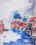 This picture was done as a demonstration in my studio using the same technique that I would use on location. The only useful function of the studio here is to provide a flat space to paint the picture and leave it while it dries. The floor of a hotel room is just as good.
I tend to have visualised a picture pretty fully before I start it. Sketches are good for testing compositional devices and practising tricky bits of drawing. Having seen a place I wanted to paint, and thought about the picture I wanted, I would usually go back there to do the final drawing.
I found it impossible to stay still for more than about half an hour, so this became the limit to the time I could spend on a drawing. This limit was mainly due to my freezing solid after sitting still for too long, but also because I get rather impatient.
This picture was done as a demonstration in my studio using the same technique that I would use on location. The only useful function of the studio here is to provide a flat space to paint the picture and leave it while it dries. The floor of a hotel room is just as good.
I tend to have visualised a picture pretty fully before I start it. Sketches are good for testing compositional devices and practising tricky bits of drawing. Having seen a place I wanted to paint, and thought about the picture I wanted, I would usually go back there to do the final drawing.
I found it impossible to stay still for more than about half an hour, so this became the limit to the time I could spend on a drawing. This limit was mainly due to my freezing solid after sitting still for too long, but also because I get rather impatient.
The drawing is very important to me. It is an integral part of the picture, and not just a guide as to where to put the colours. The lines must be bold, expressive, and correct. It is important not to make any erasures, as this will affect the way the paint goes onto the surface at that point. On the other hand, sometimes I will smudge things up deliberately with a finger, to give a bit of mood to a particular area.
I must be happy with the drawing as an entity before I will paint. A useful skill to acquire here is that of throwing away expensive bits of paper without remorse; even those you have carried halfway around the world.
The painting is the part that brings the idea of the picture to life. I only use about eight colours, but it is important to know how each of them works. By that I mean that each pigment has its own way of interacting with the others. Some are sticky, some runny. Some will push others away, and some will mix in and swamp another completely. It is vital to know what will happen when two wet colours meet on the page, as once they are there I believe that they should not be touched. I will sometimes put two colours on different parts of the brush to allow them to mix on the paper, but never mix them on the palette, as this diminishes their brilliance.
When preparing to paint I squeeze out the colours I want, at the same time working out the order in which I will apply them. There is no rule to this; in this picture I have done the buildings first, which is not a bad way to go about it because once the foreground colour is there I can decide how much of it I want to bleed into the sky and the water.
I have started with Alizarin Crimson, Permanent Rose and Cadmium Yellow. The Crimson and Rose are both runny, and can be pushed around by other colours later on. Cadmium Yellow is a very strong, sticky colour, and here I will use it with a lot of water so that it will not overpower the others.
The dark shadows are Paynes Grey, a much cooler colour than the rather hot Charcoal Grey. It has the disadvantage of drying much lighter than it appears when wet, and so needs a very heavy hand. Care is needed though, because it is also one of the runniest of colours, and will swamp everything around it if given a chance.
For the domes I have used one of my favourite pigments; Cobalt Turquoise. This is a very sticky colour of great strength, and a joy to use. You can see how I have touched the very wet sky into the domes, allowing the turquoise to run in without losing its depth in the domes.
The other main colour I have used is French Ultramarine. This is the most versatile of the blues, capable of lovely deep tones without losing its transparency, and delicate wispy washes when used with lots of water. For the canal water I have loaded my brush as heavily as I can with French Ultramarine on one side and Cobalt Turquoise on the other, and allowed these two to play together on the paper.
The next thing to do is to stop. Resist the urge to touch up a section, or add that little extra bit that you will regret as soon as you have done it. Put the picture somewhere safe and flat, and look at it again when it has dried.


